Friday, 15 December 2017
Tuesday, 12 December 2017
Critical Evaluation
Question 1
For the research stages of my front cover and content page I have used many different technologies such as real media products (magazines), Google, Google Images and Blogger. I have used the real media products so that I can get inspiration from them and so that I can get my initial ideas as well. From this I used Google to research about the conventions of magazine and I started to think of how I could incorporate or challenge them in my own work. I used Google Images so that I could find more magazine cover and content page so that I could have a broader understanding of what I could do with my media product. Furthermore, I have used Blogger to present my work - I have used blogger because it was the best way to do it as it allows you to have text, images and videos and have better presentations. Overall, all of these programs have helped to get the ideas which I had and also helped me with the most crucial part which is the planning.
For the evaluation stage of my front cover and content page, For this I have used Blogger, Google Images, Emaze and Prezi. I have chosen to use different technologies for each of my evaluation question so that my presentation can look more interesting and easier to read through. I have used Emaze in to answer question 2 because I think that it allows the presentation relate more to the theme of Jazz - at time where Jazz was at peak in popularity so were silent movies and that is what I based my presentation on; I think that this worked out well as it is the most interesting presentation which I have done for my evaluation. I have chosen to used Prezi to answer my first question as it gives the presentation a unique look and is. I have used Photoshop to edit and create my magazine. it is a professional software that real life magazine editor may use.
For the evaluation stage of my front cover and content page, For this I have used Blogger, Google Images, Emaze and Prezi. I have chosen to use different technologies for each of my evaluation question so that my presentation can look more interesting and easier to read through. I have used Emaze in to answer question 2 because I think that it allows the presentation relate more to the theme of Jazz - at time where Jazz was at peak in popularity so were silent movies and that is what I based my presentation on; I think that this worked out well as it is the most interesting presentation which I have done for my evaluation. I have chosen to used Prezi to answer my first question as it gives the presentation a unique look and is. I have used Photoshop to edit and create my magazine. it is a professional software that real life magazine editor may use.
My magazine
Monday, 11 December 2017
Wednesday, 15 November 2017
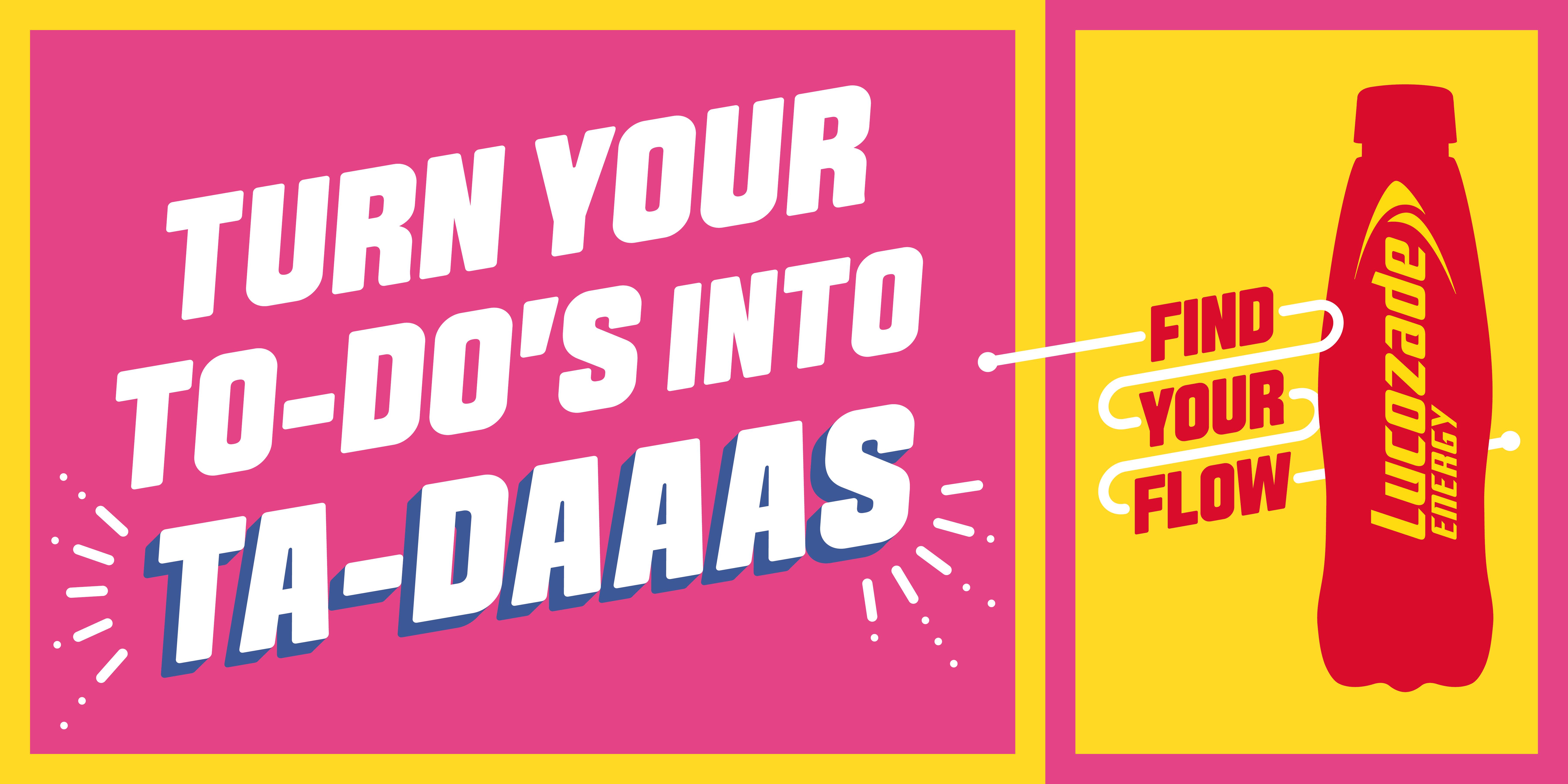
Lucozade
Contemporary Poster
 |
Lucozade poster advert from ‘find your flow’ campaign in
2015.
|
Historical Poster
 | |
Lucozade poster advert in 1953.
Similarities: Both these posters still advertise the
factor that drinking this will give you ‘energy’
Differences: The contemporary poster is simple but bold
poster that can be read from a far distance and it gives the message can be
interpreted vey quickly. It also use bright colours and big font that is every
eye catching. Also it has a quick simple slogan that is an easy ‘roll of the
tongue’. The phrase they use ‘turn your to-do’s into ta-daas’ has a sense of
humour and is targeted towards audience who have a busy schedule such as
students, working parents etc.
Differences: The historical poster is not one that
someone could read from afar and it advertises the factor that Doctors and
Nurses use their product. It also has a image of two girls drinking it, which
targets parents, grandparents etc to buy this drink as it is good for their
child and the fact that it is almost ‘approved’ by Doctors and Nurses gives
parents a reason to trust the brand as if Doctors use it, than its not bad for
your health etc. It was also used in during that time period as something you
give to someone who was ill to make them feel better.
|
Monday, 13 November 2017
Media Preliminary Task Post 8-Feedback on Design
Media Preliminary Task Post 7- Flat Plan
|
|
| This is my Flat plan on the front cover of my magazine. I made sure to include a big masthead as seeing the results from my survey people find the magazines name most interesting. I also included a puff as my target audience like if a magazine is a special edition which is what the puff would say. |
Media Preliminary Task Post 6- Shot list
This is my shot list of different poses I will try and take. All shots I plan to take are simple and the model is in a relaxed position to reflect my magazine's genre which is jazz.
Media Preliminary Task Post 5- Genre- Font styles & Name Of Magazine
Media Preliminary Task Post 4-Target Audience,Reader Profile & Survey
Target audience
My intended target audience is from 17+ people who like to listen to jazz or blues my magazine is something they can read as a type of relaxation. my target audience are people who are into Jazz and like listening to Jazz for example if my target audience is an 18 year old i would imagine they listen to jazz music whilst doing their work so they could also read my magazine when they are in bed etc. my target audience also could be a senior who likes to sit on her sofa reading jazz magazine whilst listening to Jazz. My audience is more targeted towards women but men can also read my magazine. My target audience is also targeted towards anyone who is interested in jazz regardless of race or faith etc. As they aren't many black models people see in magazine so i would put a black model in my front cover to show that my magazine is diverse and celebrates all race not just white.Survey
I took a survey in order to understand what the audienece is interested in.so i can include it in my own magazine and people would be interested in it to pick it up and buy it. This was my result.
Friday, 10 November 2017
Media Preliminary Task Post 2- Deconstruction Of Real Media Texts
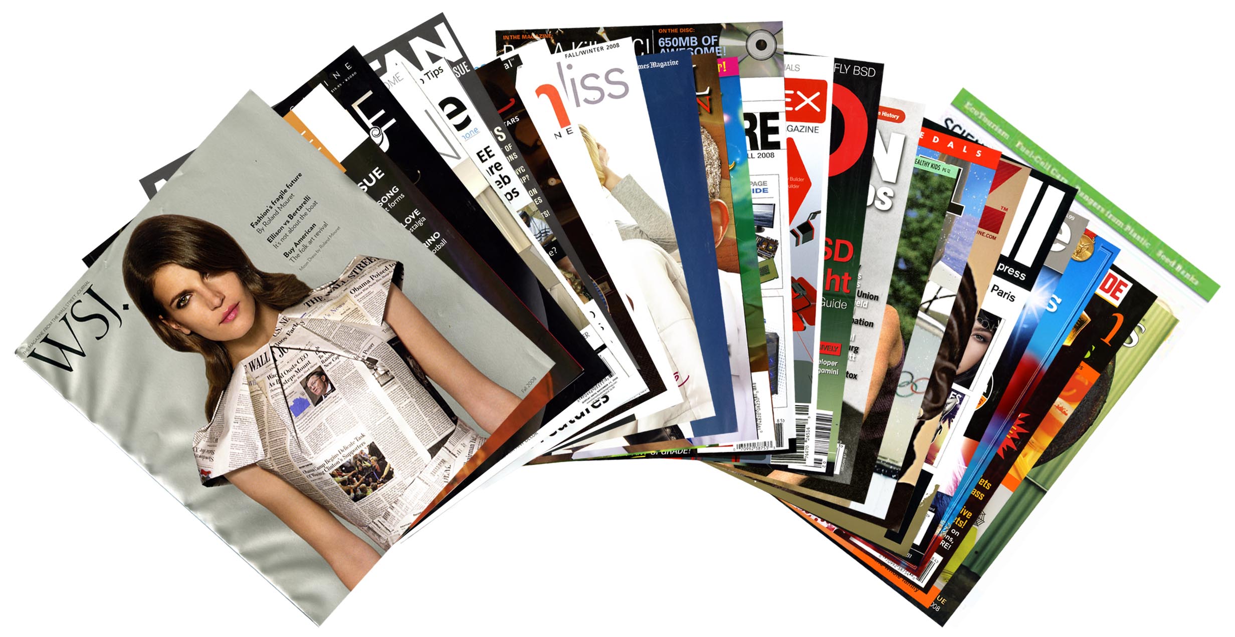
I have deconstructed a few music magazines to help me understand a convention's of a music magazine and what I can add to my own magazine.
Media Preliminary Task Post 1- Introduction
Brief: To create the front
cover and contents page of a new music magazine using Photoshop.
For my preliminary Task i first plan to deconstruct real music magazines to help me understand and guide me on how my own music magazine should be, and later comparing my flat plan to real media texts. I than plan on having a focus group with the audience my magazine is targeted at. i will also create a survey to see what people are most interested in. i pan on trying different font styles for my magazine to see which suits it best. i will create a shot list later once i have an idea or initial design on what my magazine is going to be. I will also get feedback on my design to see where i can improve on.
For my preliminary Task i first plan to deconstruct real music magazines to help me understand and guide me on how my own music magazine should be, and later comparing my flat plan to real media texts. I than plan on having a focus group with the audience my magazine is targeted at. i will also create a survey to see what people are most interested in. i pan on trying different font styles for my magazine to see which suits it best. i will create a shot list later once i have an idea or initial design on what my magazine is going to be. I will also get feedback on my design to see where i can improve on.
Monday, 16 October 2017
Deconstructing Media
Deconstructing Media texts
All media messages – TV shows, newspapers, movies, advertisements, etc. – are made or
constructed by people. One of the most important media literacy skills is deconstruction –
closely examining and “taking apart” media messages to understand how they work.
Deconstructing a media message can help us understand who created the message, and who is
intended to receive it. It can reveal how the media maker put together the message using words,
images, sounds, design, and other elements. It can expose the point of view of media makers,
their values, and their biases. It can also uncover hidden meanings – intended or unintended.
There is no one “correct” way to deconstruct a media message – each of us interprets media
differently, based on our own knowledge, beliefs, experiences, and values. Just be prepared to
explain your interpretation.
http://www.21stcenturyschools.com/uploads/2/1/5/4/21542794/deconstructing_media_messages.pdf
Misenscene
Misenscene is everything that is in the media text such as:
- colour
-clothing
-objects/furniture
-model
-location
-written text/Typography etc.
Deconstructing Magazines
The main conventions of a magazine:
- Masthead:the title/brand name of the magazine.
- Image: a photograph or graphic.
- Cover lines/features: list of contents in the magazine.
- Anchor: the text which links to the image.
- bleeding: when the image covers the text or vice versa.
- Angle of glaze:the angle in which the subject/artist is looking st the consumer.
- Puff: a'puff' of information. A small piece of text to help boost the status of the magazine e.g. a sticker shape.
- Plugs: information about the content of the magazine. it promotes whats inside.
- Pull quote: a quote from an interviewee inside the magazine.
- Caption: a small text which explains the image.
- Strap line: a cover line which spans to the width of the front cover.
- House style: common conventions used by a brand or make to make it easily recognizable to the consumers.
Examples of deconstructing magazines:
Teen vogues house style makes it easily recognizable to the consumers.
--------------------------------------------------------------------------------------------------------------------------
The house style makes it easily recognizable to the consumers.
--------------------------------------------------------------------------------------------------------------------------
The house style makes it easily recognizable to the consumers.
Friday, 6 October 2017
Introduction To Media
The Media Theoretical
Framework
Media Language >>> The way in which a
text is constructed to create meaning for a reader or viewer of the text.
forms target, reach and address audiences and how the audience themselves interpret and respond to them.
Media Contexts>>>
How media reflects social, cultural, historical, political and
economical context.
-Social context reflects and influences how the people around something use &interpret it.
-Cultural context is the way that media producers communicate with the people living in society.
-Political context reflects the environment in which something is produced, indicating it's purpose or motive.
-Social context reflects and influences how the people around something use &interpret it.
-Cultural context is the way that media producers communicate with the people living in society.
-Political context reflects the environment in which something is produced, indicating it's purpose or motive.
9 Forms of Media
| Film |
| Televison |
| Magazine |
| Newspapers |
 |
| Music |
 |
| Video Games |
| Radio |
 |
| Advertising |
| Online |
Subscribe to:
Comments (Atom)


